When you need to convey a complex topic to your audience, say it with an infographic. Because images are processed simultaneously and text is processed sequentially, visuals are processed an incredible 60,000 times faster than text. That means that a reader is going to have that “aha” moment of realization much more quickly if they’re presented with an infographic than if they’re presented with a block of fact-filled text.
I’ve been sharing this series because I want to arm marketers and small business owners with the tools they need to better convey information through comprehensive infographics. I’ve already discussed basic forms of data visualization, in which data is arranged in a chart or graph without interpretation, and information visualization, in which that data is arranged into a sort of schema to tell a story. This week, I’m going to look at how to visualize qualitative concepts in an infographic.
Concept Visualization
When you share quantitative data, such as the number of kids in a classroom on a certain day, you’re not leaving much up to interpretation. However, it’s a different story if you want to share qualitative data, such as the general mood of kids based on their seat in a classroom. Qualitative data is based on descriptive information, not finite numbers, which can sometimes make it tricky to convey through an infographic.
Fortunately, there are several useful ways to visualize qualitative concepts. 16 of them are described below.
Mind Map

What Is It? Mind maps typically start with a central idea, which is represented by an image or phrase. Associated ideas are then connected to the central idea with “branches.” Visually, it looks similar to the cluster map I discussed last week, but it differs in that the emphasis is on one word or idea.
Best Use: Parse out in-depth concepts, like a business goal or career requirements, using a mind map.
Square of Oppositions
What Is It? This diagram sets up contrary statements on the two vertices at the top of the square, then sets subalterns (ideas that are implied by the two top statements) at the bottom two corners. As a result, the statements diagonal from one another are contradictory.
Best Use: Although they’re not frequently seen in infographics, squares of opposition can be used to show how four propositions are related to one another.
Concentric Circles
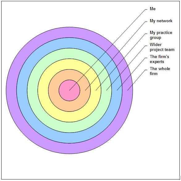
What Is It? Circles of different sizes share the same axis, and ideas are placed in each circle with the broadest concept in the largest circle and the most specific concept in the smallest circle.
Best Use: Concentric circles can help illustrate how specific ideas are encompassed in larger ones (e.g. a qualified available market is encompassed in the total population, and a target market is encompassed in the qualified available market).
Minto Pyramid Technique

What Is It? This chart is based on the argument that a single thesis (at the top of the pyramid) should unify a series of ideas. So, at the top of your pyramid, you might have a hypothesis, and under that you would have 3 complications phrased as questions. Each of those complications could be broken down into more specific questions which form the base of the pyramid.
Best Use: Use the Minto pyramid technique to outline a single hypothesis or question, such as “How will Amazon shipping rates affect ecommerce?”
Cause-Effect Chain

What Is It? A cause will typically be listed on the right (or at the top) with arrows leading to an effect to the left (or below). Each effect may also have arrows pointing to additional effects.
Best Use: This type of chart can be incredibly useful in illustrating a ripple effect, such as showing what a donation to your non-profit helps achieve.
Soft System Modeling

What Is It? Soft system modeling typically separates ideas or activities into bubbles and connects those bubbles with arrows, where each arrow represents logical dependence.
Best Use: Use soft system modeling to depict the step-by-step process of an activity, such as creating a Google search ad.
Force Field Diagram

What Is It? A force field diagram starts with a central box containing an opinion or a proposal for change. The forces working for the proposal are listed in a column on one side of the box while the forces working against the proposal are listed in a column on the other side.
Best Use: This diagram is most useful when you want to look at pro-con issues, like raising the minimum wage to $15 in Seattle.
IBIS Argumentation Map

What Is It? Short for issue-based information system, this map presents boxes of evidence with arrows leading to arguments and counterarguments based on the evidence. There are also arrows leading from the arguments to proposals, as well as arrows leading from the proposals to a decision.
Best Use: You might use an IBIS argumentation map if you wanted to illustrate how your business reached a certain decision, such as deciding to use an open office plan.
Flight Plan
What Is It? This chart type uses the metaphor of an airplane flight to break a process into six sequential columns: starting, rising, flying, turbulence, landing, and landed, with each column representing a different part of the process.
Best Use: A flight plan might be useful in depicting the steps of a process that you want to teach your product users, such as the process of using your recruiting software to make new hires.
Concept Skeleton
What Is It? This chart is used to look at the “anatomy” of a concept by starting with a central concept in a box. Separate boxes contain the concept definition, elements, examples, and consequences or implications.
Best Use: Concept skeletons are best for breaking down a complex idea into digestible elements (e.g. the concept of filibustering in US politics).
Swim Lane Diagram

What Is It? The name comes from the fact that this chart is laid out like a pool with even lanes. The lanes can be arranged either horizontally or vertically to show the progression of a process or activity within different discrete groups.
Best Use: Swim lanes can be used to show how different departments within a business all contributed to the completion of a project.
Perspectives Diagram
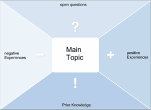
What Is It? A perspectives diagram is a visualization method that starts with a main idea in a central box. Positive and negative experiences with that idea are listed on either side, with open questions about the topic listed above and prior knowledge about the topic listed below.
Best Use: Perspectives diagrams aren’t meant to drive the viewer to a particular conclusion; rather, they’re best for encouraging viewers to think about multiple sides of a topic based on what is known or unknown. For example, it could be used to make an infographic about the legitimacy of social media activism.
Dilemma Diagram
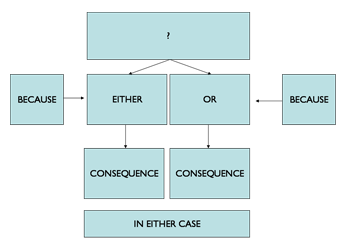
What Is It? A dilemma diagram starts with a primary box containing a question, which then leads to two or more boxes with potential outcomes to the dilemma. Each of these boxes leads to boxes containing possible consequences.
Best Use: Dilemma diagrams are best for problem solving scenarios when multiple outcomes are possible (e.g. an infographic asking the question, “What would happen if…?”).
Critical Path Method (CPM)
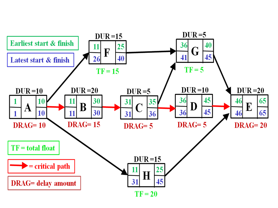
What Is It? CPMs are used to model a logical path for a project with interdependent activities. Each step or task is contained within its own circle, and the steps are ordered using a series of arrows.
Best Use: CPMs are typically used for modelling projects across a wide range of industries, including construction, engineering, product development, and facility maintenance.
Concept Fan

What Is It? A concept fan starts with a broad problem or question in a circle. Arrows lead from that circle to a series of circles on the right that break the problem down into more specific problems or goals. Ideas for solutions stem from each of those circles.
Best Use: Concept fans are best for illustrating multiple potential solutions to a broad problem, such as traffic congestion in a rapidly growing city.
Vee Diagram

What Is It? A focus question is placed above the V-shape, and conceptual ideas related to that question are placed on the right side of the V, while a proposed methodology for investigating those ideas is placed on the right.
Best Use: Vee diagrams can be used to propose a method of experimentation, or for methodically investigating and evaluating a report.
I just working on Iconographics for my work. The IT industry in which I illustrate a few things related to internet domain market and I must say that your entries about how to create such iconographics are awesome! Thanks for the great tips!
Thank you! Appreciate you sharing your comments!
It is really a nice and useful piece of info.
I am glad that you simply shared this helpful information with us.
Please stay us informed like this. Thank you for sharing.