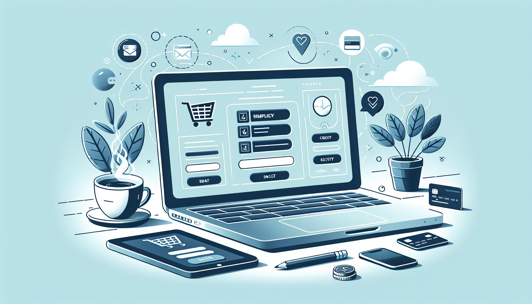
Mastering Checkout Page Design: Boost Sales and Minimize Cart Abandonment
In the digital marketplace, the checkout page is your final frontier. It’s where the magic happens, where browsing turns into buying. But it’s also a place where many businesses stumble, losing customers at the last hurdle.
Designing an effective checkout page isn’t just about aesthetics. It’s about understanding your customers, their needs, and their frustrations. It’s about creating a seamless, intuitive experience that makes purchasing a pleasure, not a chore.
Importance of Checkout Page Design
The design of a checkout page significantly shapes a customer’s purchasing journey, far beyond visual appeal. I’ve outlined a couple of aspects below that stand out for their potential in transforming customer experience and boosting business outcomes.
Increasing Conversion Rates
A checkout page that’s thoughtfully laid out enhances the customer’s shopping path, nourishing their purchasing intent. Subtle elements, for instance, clean lines and intuitive navigation, prompt customers to complete transactions. Businesses, by virtue of this design, witness lesser bounce rates. Clear calls to action serve as guideposts, steering customers to make the ultimate leap: the buy. Direct payments methods or options to save cart details for future purchases add an extra layer of convenience, further tipping the scales in favor of conversion.
Reducing Cart Abandonment
The occurrence of cart abandonment is a glaring hiccup in the customer buying journey, essentially stalling a transaction in sight of the finish line. Aptly designed checkout pages, thus, take on the role of problem solvers. They fortify trust by clearly displaying security logos and adhering to secure payment practices. The absence of hidden costs, shipping charges, for example, that pop up during the final stages, tends to retain customers by maintaining transparency throughout the process. Other solutions include the simplification of the checkout process by minimizing forms and reducing the number of steps to complete the purchase, greatly lightening the load for thrifty online shoppers.
Key Elements of Successful Checkout Page Design

Enriching the checkout page experience entails paying keen attention to certain integral elements. Let’s delve into the key constituents that bolster a successful checkout page design.
Simplicity and Clarity
The essence of simplicity and clarity in checkout page design becomes vivid when you consider two key factors. One-Page Checkout strikes as particularly effective, as it eliminates the multiple steps common to traditional checkout processes, facilitating a quicker, more streamlined buying journey. Clear and Concise Information is no less significant. It’s about laying bare all necessary details, from product specifications to delivery details, payment options, and all-inclusive costs. Transparency nurtures customer trust, a fundamental component in reducing cart desertion.
Providing a Guest Checkout Option
Guest Checkout serves as another indispensable element of design. The option for customers to checkout without forming an account mitigates friction, thereby heightening the possibilities for successful conversion.
Security and Trust Signals
Yet to be fully covered, these are lifelines of a thriving checkout page. More on this follows shortly in the write-up. Remember, enforcing stringent security measures and showcasing trust signals dampens consumer apprehensions, cementing their confidence in your brand.
Incorporating UX Principles in Checkout Page Design

Following key UX principles, I’ll illustrate their application to checkout page designs, boosting usability and ultimately improving conversion rates.
Applying Minimalist Design
In checkout page design, the principle of minimalism reigns supreme. Comprehensible labels like “Email Address” rather than vague “Email” his shorthand enhances clarity. For example, by grouping related fields like “Payment Information,” you tighten user focus, eliminatating extraneous distractions. Business logos should be downsized and unnecessary promotional banners omitted to maintain a sleek, simple design optimized for user completion. Each element on the page, whether it’s a data field or a button, demands a clear purpose.
Streamlining Checkout Process
Smooth, logical arrangement of form fields is crucial for a streamlined checkout. Think about the intuitive flow of user interaction, designing the form to reflect this progression naturally. For instance, collect customer’s contact information before payment details. By grouping related elements together in a meaningful sequence, you create a user-friendly journey from the “Add to Cart” button to the final “Place Order” click.
Using Auto-Fill Features
Remember those badge and security icons agents, such as VeriSign and McAfee? Alongside a responsive design methodology, they’re vitally important. Displaying these trust signs on your page reassures users that their data, especially sensitive payment information, is secure and encrypted. But there’s another UX principle to employ here: auto-fill features. By allowing the browser to fill common fields, such as addresses, it reduces the completion time and effort, significantly reducing cart abandonment rates. Equally important, ensure bigger, more prominent buttons, convenient spacing, and apt touch targets, notably for smaller, mobile screens.
Role of Mobile Responsiveness in Checkout Page Design
Mobile responsiveness plays a pivotal role in checkout page design. It’s instrumental in ensuring that the buying experience remains smooth, consistent, and user-friendly across a variety of devices.
Adapting to Various Screen Sizes
Ease in navigation becomes critical for checkout pages, and mobile responsiveness brings this to the table. With this, a checkout page adapts its content and layout automatically to provide an optimal viewing experience. You’ll see this in action on different devices, such as smartphones, tablets, or desktops. These changes enhance the user’s experience by accommodating their chosen device’s screen sizes, without needs to zoom in or pinch the screen. High engagement rates and better conversion chances become possible outcomes from this design strategy.
Retaining Functionality On Different Devices
Not only does a mobile responsive design maintain readability, but it also assures full functionality across devices. A checkout page viewed from a mobile device, functions just as efficiently as it does on a desktop. This aspect is essential as Google gives priority to mobile-friendly sites while displaying search results, tying mobile responsiveness directly with search engine optimization (SEO). Consequently, more traffic heads towards such sites, enhancing visibility, and eventually leading to higher conversion rates.
Case Studies: Successful Checkout Page Designs

To further illustrate the power of effective checkout design in practice, let’s delve into some real-life examples.
Case Study 1: Company X
Company X, a titan in the e-commerce realm, accomplished a noteworthy uplift in conversion rates through a crucial redesign of their checkout page. This redesign revolved around simplifying the checkout process, trimming friction points, and bolstering mobile receptivity.
Key Adjustments
- Simplified Checkout Procedure: Consolidating the checkout process into a single page, the fresh design skirted any requirement for multiple pages, subsequently slashing the time spent at checkout.
- Geared for Mobile: Mobile optimization was a key factor in this overhaul. It garnered a flawless and instinctive experience for those using handheld devices.
- Transparent & Succinct: Attention was paid to ensure clear and concise display of product information, shipping particulars, and payment methods, thereby curtailing any likely customer complications.
- Trustworthiness: Integration of trust emblems and security affirmations succeeded in boosting customer trust during the checkout process.
Outcomes
[The outcomes data of the company X]
Tips for Creating an Effective Checkout Page Design
Let’s move further by delving into specific strategies designed to bolster the effectiveness of your checkout page.
Optimizing Page Loading Speed
Page load speed plays a pivotal role in the design of an efficacious checkout page. A speedy page, equipped with the ability to load in a mere two seconds, contributes significantly towards keeping the customer engaged. For instance, the e-commerce behemoth, Amazon, even found a 1% loss in sales for every 100ms delay in page load time. Hence, optimization of loading speed isn’t just an option; it’s a must for online businesses. E-commerce platforms like WooCommerce offer a variety of speed-boosting plugins like WP Rocket to aid in speed optimization.
Using Progress Indicators
Another tip lies in the strategic use of progress indicators throughout the checkout process. Displaying step-by-step progress reinforces the customer’s sense of control and engagement. It provides actionable steps like ‘Shipping Information’, ‘Payment Details’, ‘Order Review’ which help maintain a sense of direction. For example, renowned online fashion store, ASOS, uses progress indicators visibly, which is one of the keys to their low cart abandonment rate. Integrating progress indicators effectively could, therefore, drive your checkout page towards success.
Conclusion
So we’ve seen how checkout page design can make or break your customer’s experience. It’s not just about aesthetics; it’s about functionality, simplicity, clarity, and trust. Ensuring your page is secure and easy to navigate can significantly reduce cart abandonment. And let’s not forget the importance of mobile responsiveness. With more users shopping on their smartphones, it’s crucial your checkout page is optimized for mobile. Lastly, speed optimization and progress indicators can make a world of difference in user engagement. Take a leaf out of Amazon and ASOS’s book – their successful strategies emphasize the power of a well-designed checkout page. So, remember, when it comes to checkout page design, it’s all about creating a seamless, user-friendly experience that will keep your customers coming back for more.
What is the importance of checkout page design?
Checkout page design can significantly influence customer experience and ultimately, business success. A well-designed checkout page can reduce cart abandonment, enhance conversion rates, and boost sales by making the process clear, simple, and secure.
How does design simplicity impact conversions?
A simplified design can optimize conversions because it eliminates potential distractions and allows customers to focus on completing their purchases. Complex and cumbersome designs often lead to increased cart abandonment.
Why is mobile responsiveness important in checkout page design?
Mobile responsiveness ensures a consistent shopping experience across all devices. With the high number of users making purchases from mobile devices, a mobile responsive checkout page can significantly impact engagement and SEO.
How can loading speed affect customer engagement?
The loading speed of a checkout page is a decisive factor in maintaining customer engagement. Slow loading times can frustrate customers, consequently causing them to abandon their carts and negatively affecting sales.
What role do progress indicators play in checkout page design?
Progress indicators in checkout page design inform customers about their stage in the buying process and what comes next, thus helping manage customer expectations, engagement, and control.
How do trust signals help in checkout page design?
Trust signals like security badges and customer testimonials facilitate trust in a website. These elements can reassure customers about the credibility of a business and the safety of their transactions, boosting conversion rates.
What real-world examples are there of effective checkout page designs?
Prominent companies like Amazon and ASOS have streamlined checkout processes that have proven successful in boosting sales and reducing cart abandonment rates. Their strategies emphasize speed optimization and clear progress indicators.